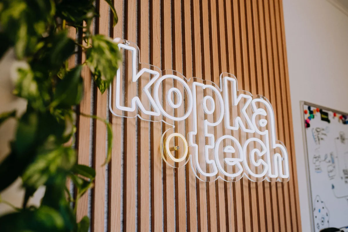
Kopka Tech
About Us
We believe Estonian businesses deserve world-class digital solutions.
Kopka Tech is a Tartu-born web software agency that believes every business deserves systematic solutions built precisely for their needs — not cobbled together from a generic template.
What our clients say
Client feedback
Our most important goal
“The custom system that manages our store, bookings and inquiries is incredibly comfortable - everything is in one place and works perfectly!”
Dulkan
E-store, rental system & admin panel
“The collaboration was smooth and the result exceeded expectations - the website looks exactly as professional as we wanted!”
A-Velg
Website & content creation
Our story
"The best solutions start with a meaningful conversation and a shared understanding of goals."
Kopka Tech began with a simple observation: too many Estonian businesses are stuck with solutions that actually hold their business back. Slow WordPress-based sites, integrations thrown together in a hurry, and endless paid add-ons — it shouldn't have to be this way.

The Kopka team focuses on making sure every partner gets a solution built exactly for their needs — thoughtfully and sustainably.
Our approach is simple: we listen, think together, and then build. Every project starts with a conversation where we map out what the business really needs. Then we find the smartest path forward — we break work into logical phases, review outcomes together, and adjust course when needed. We don't sell hours — we sell results.
Our values
The principles that guide every decision and line of code.
Clear communication
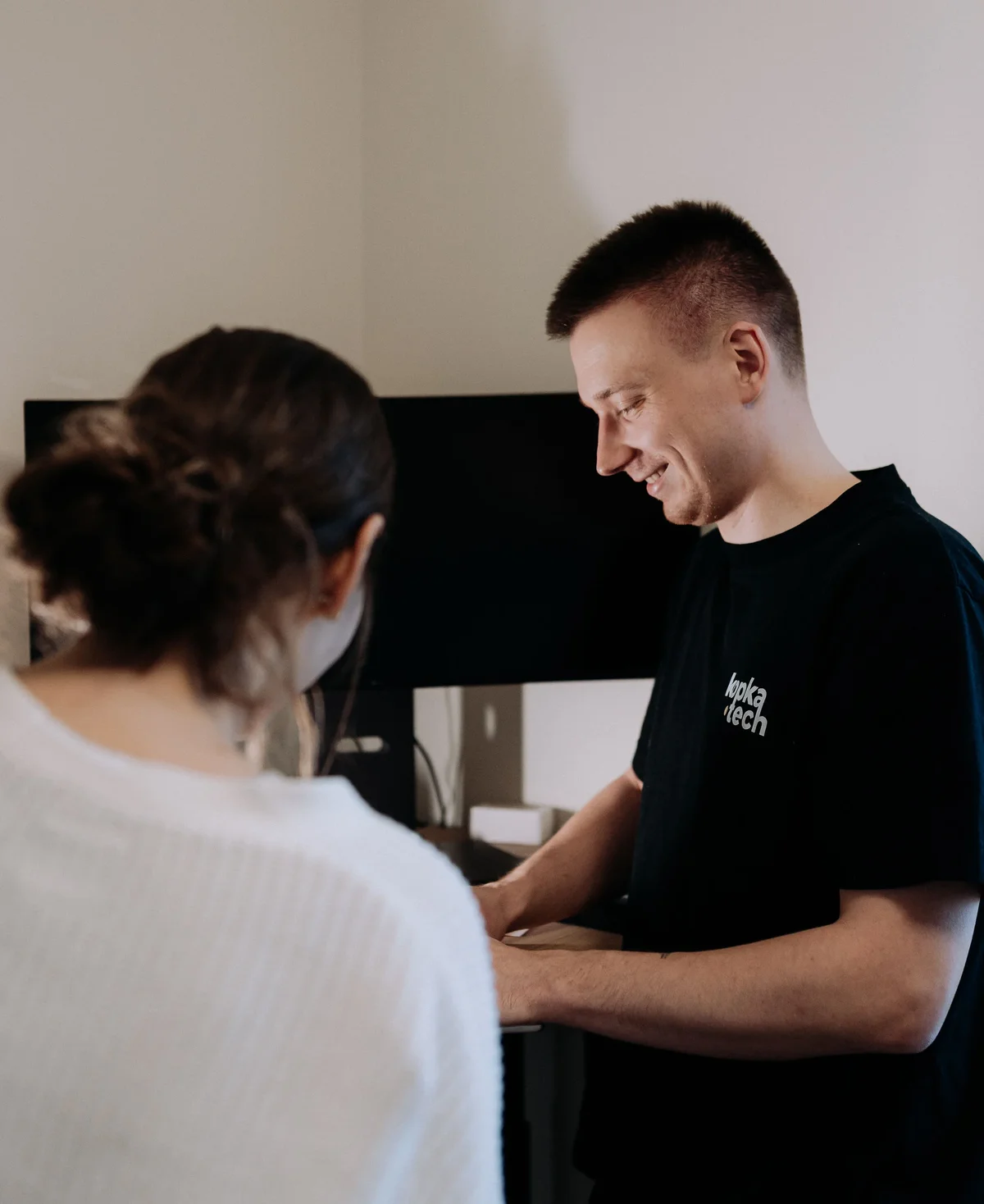
Our number one priority. Ongoing communication between everyone involved is the foundation of every successful project. We keep each project team deliberately small to avoid information loss from constant context switching. Clients never need to wonder how far along we are — we proactively keep them informed.
Accountability & quality
We take responsibility for every solution we build. A detailed project scope at the start of the work ensures shared understanding. Ongoing communication keeps deviations under control. At handover we clearly document what was delivered and set out guarantees and ongoing responsibilities.
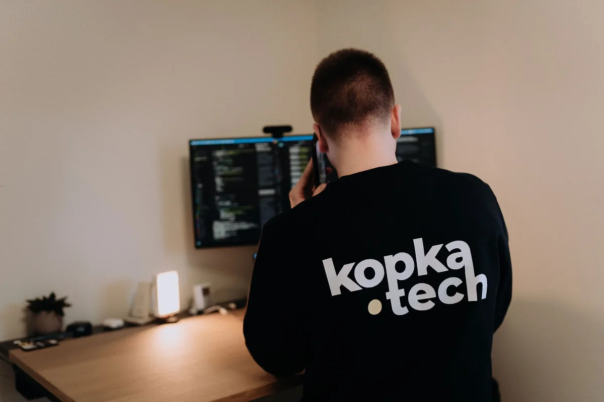
Small, senior teams
We harness the full potential of AI so one or two senior full-stack developers and designers can deliver in a week what traditional agencies need months for. Fewer people, less information loss, more focus.
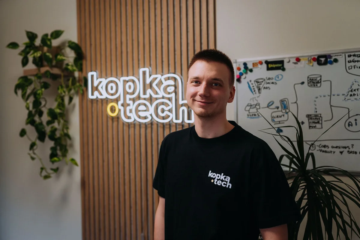
Our team
Small core. Trusted network.
At the heart of Kopka are senior developers with a sharp eye for design details. For each project, we assemble the exact specialists needed from our trusted partner network — developers, designers, QA, marketing.
We don't believe in heavy, complicated hierarchies. We keep project teams light and flat. Everyone has the context they need and owns the outcome. Our partners are the heart of Kopka.
Our visual identity
Three colors. One journey.
"Every project begins on a blank canvas. We bring the spark that ignites the light."
Canvas
The calm sky on which every solution is born. A canvas waiting for its first brushstroke.
Spark
The creative spark that sets things in motion. The moment an idea takes shape.
Light
Light that ignites at the end. A result that radiates and brings clarity.
Typography
Montserrat
ABCDEFGHIJKLMNOPQRSTUVWXYZ
abcdefghijklmnopqrstuvwxyz
0123456789
Geometric yet warm. Montserrat is our primary typeface, combining technical precision with human warmth — exactly like our solutions. Clean proportions ensure readability on every screen and at every size.
Inter
ABCDEFGHIJKLMNOPQRSTUVWXYZ
abcdefghijklmnopqrstuvwxyz
0123456789
Purpose-built for screens. Inter is our supporting font for longer texts and user interfaces — optimized for small-size legibility and a neutral backdrop that lets the content speak.
Geometry
Circle
In our logo, the "o" is a perfect circle symbolizing a complete solution — from start to finish, with no missing pieces. Every project we deliver is a full cycle: listen, plan, build, hand over.
Dot
The dot is the smallest visual unit. Together they create rhythm. It acts as both separator and connector across our brand. Just as clear communication breaks a complex project into manageable steps. Each dot is small, but essential.
Ready to start?
Every project starts with a conversation. Tell us about your idea and let's see how to make it real.
Get in touch